
It’s Friday, (and shockingly, I’m still doing this project), that means it’s time for The Writer Blog Prompt Project, with today’s topic of Drop Caps.
Let’s go!
Quick reminder, if you join this project and write an article about this week’s topic. Let me know and I’ll link your article at the bottom of mine.
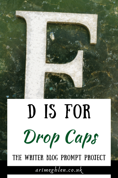
D Is For Drop Caps
In case you aren’t aware, drop caps are where the first letter in the first paragraph is larger. You often find them in news articles and several authors now use them in their books. They make the first letter of each chapter larger so that it takes up several lines below it.
Like this…
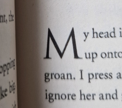
Okay, I’m just going to say it… I HATE drop caps!
*ducks for cover*
It’s probably one of those things, like the Oxford comma that has a staunch following and just saying this may get me glared at.
But hear me out…
I LOVE drop caps.
Ari, what is wrong with you!? Why do you do this??
Let me explain. The original drop caps were these beautiful, ornately decorated letters. You can find them in really old books. And they are stunning to behold. They were (obviously) hand draft, inked and coloured with expert hands and delicate care.
Even ones that didn’t have the same level of intricacy, were still pretty. Below is a nice example of a letter G in a decorative style that would have been used as a drop cap.

Now, if THESE or any other beautifully created letter was used in current novels, I would be ALL over them with praise and would include them in all my writing.
Could you imagine, the funky styles and details you could create that would fit your stories… like a pirate ship at full sail riding the surf within the sweep of a Q. Or a serpentine dragon making up the curls of a S.
But what do we get instead?
A boring serif font letter, made too big and cumbersome, affecting all the lines around it. And do NOT get me started on when the first letter of a chapter is a piece of dialogue so now you have this huge quotation mark and letter.
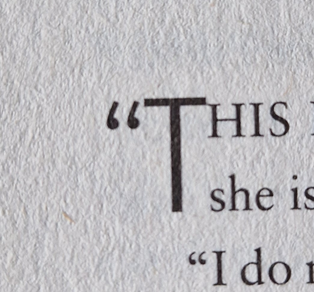
I’m sorry, but to me, it looks ridiculous and that is a hill I will die on. (I’ll admit, the example above is NOT the worse one – but I still hate it. The worse ones are usually in e-books and if I can locate an example from an ebook I’ll add it here)
Who knows? If AI managed to destroy the book industry by oversaturating it with such slop that everyone stops buying digital books. Maybe all us authors will have to start hand writing our novels and will have the chance to do large ornate lettering. :p
Or maybe this article will create a suddden trend in authors reaching out to real artists and having them create such old-style drop caps. Maybe I’m starting a new movement!
~ ~ ~
Thanks to anyone who took the time to read this article. If you aren’t joining the Project, let me know your own thoughts about drop caps in the comments below!
Next week’s topic is the Elevator Pitch
~ ~ ~
Below are articles from other participants of The Writer Blog Prompt Project
None yet, check back
Thanks for reading
Want to find me on Insta? Join my Newsletter? Follow the Podcast?
Then visit my LinkTree to find everything
~ ~ ~
Source: Header image from Canva. Decorative letter G from wingsofwhimsy. Photos from me.
© Ari Meghlen. All Rights to the works and publications on this blog are owned and copyrighted by Ari Meghlen or their respective owners in the case of guest posters, podcast hosts etc. The Owner of this site reserves all permissions for access and use of all documents on this site. NO AI TRAINING: Without in any way limiting the author’s [and publisher’s] exclusive rights under copyright, any use of this publication to “train” generative artificial intelligence (AI) technologies to generate text is expressly prohibited. The author reserves all rights to license uses of this work for generative AI training and the development of machine learning language models.

I originally had drop caps in my first book, but then I removed them.