
Recently I was offered the chance of Early Access to try out the new Visme Forms and share my thoughts. As of writing this, Visme Forms are still in a beta stage so the information I am sharing comes from what I found at the time.
This means that some of these details may be changed or amended slightly or there may be more options created by the time Visme Forms are launched.

Disclaimer: I was provided with Early Access to the feature Visme Forms in return for an honest review. All thoughts and opinions expressed herein are my own.
What Is Visme Forms?
 Visme is an all-in-one data presentation, marketing and design platform, for making visually appealing documents, infographics, charts videos and much more.
If you missed my other Visme review post, you can find it here.
The newest feature is Visme Forms which allows users to create more eye-catching and fun surveys and forms, using animated humanoid characters.
Dashboard
One thing I liked about the Visme forms was how easy they were to work with. When you first log in to Visme Forms you have this Dashboard screen. Everything is on the left menu bar and as you create and save projects these show up in the middle as you can see from the project I created.

To create a Form (or Survey) you simply go to the nice big blue button that says Create New and you get this drop-down box of options.

Select Forms and you get taken to a new page which gives you several options to choose from. As this was a beta version, only three options were available for me to test but as you can see, there were more in the pipeline.
Projects
 When I selected Lead Magnet to try out, it gave me the templates available. I really liked how the original options (eg Newsletter sign-ups, contact form, event registration etc) were still visible on this page. So if I had changed my mind, I could quickly choose a different option rather than having to click back.
The templates all have an image so you can see what style each is and can choose accordingly. These are all editable. If you hover over the image, you get 2 buttons – Edit and Preview.

I would always pick edit on a new template as I like to create a branded look. When you choose your template, you are taken to the next page. For this test, I chose ebook download. A great option for lead magnets.
You have two menus, one on either side and a centre working area. At the bottom, you can see there are multiple pages to this template.

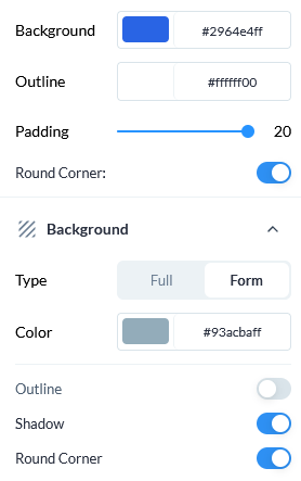
Let’s look at the left-hand menu first, this is for changing your style. That is colour, font, headings, fields etc. Below you can see some of these options, including rounding the corners of the boxes, changing the background, shadowing etc.
This is great for building branding especially if you have a specific colour scheme, background and/or font style.

Since this was a Lead Magnet ebook download, I was able to upload a copy of my short story book cover into the relevant area. Now, when I (very quickly) made my book cover I didn’t take into consideration the size of it.
While Visme Forms allows you to edit the image and move it within the correct size, you will need to make sure your book cover image is correctly proportioned otherwise, as you can see on mine, the text is too close to the top. This has nothing to do with Visme Forms and everything to do with me not making sure my cover proportions were correct to begin with.
You can also view a preview of your project on both desktop and mobile. In the image below, I tried mobile and this was the image I got, nice and streamlined. As with everything, it’s always best to check all previews to make sure everything looks ok.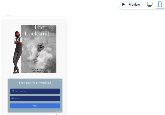
Characters
 The animation offered in this program allows you to make the forms and opt-ins more interactive.
We already know that people are more likely to watch a video or a reel than to read a static image on say Instagram, so having an animation on something as standard as an opt-in makes sense to draw your readers/followers in.
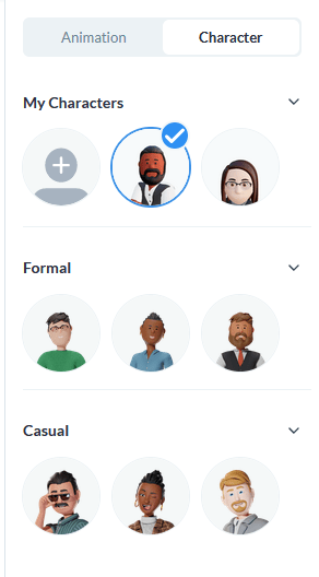
There are several “characters” to choose from to include in your project.
You also have formal and casual, this refers to the stylisation of the character. It’s hard to describe, but it does not refer to the clothing or hairstyles but the way the character’s body design is.
So first you need to pick which character you like. From the image opposite you can see three heads per category. However, three is a small arrow allowing you to open up more options.
When you pick your character, it will circle them with a tick and when you hover over there is an edit button.
Your editing options start with the basics, selecting gender, style and skin tone. Then you move on to the head. This gives you further options such as changing the hairstyle (but not the hair colour, I’m afraid) there are 39 different options. If you chose a male character, then you have beard options.


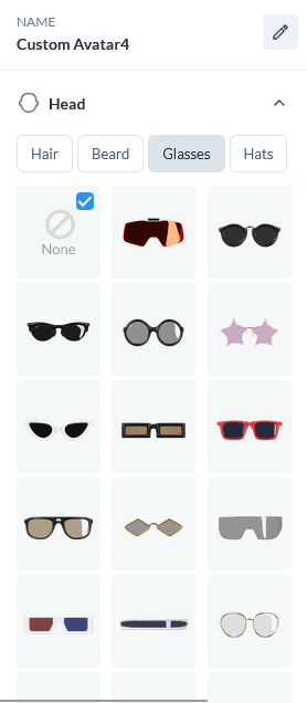
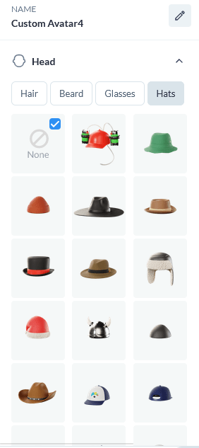
After you’ve chosen the hairstyle, you can move to glasses which include sunglasses, and even 3-D glasses and then hats, should you choose to. I like the idea of hats, because there is a Santa hat which means you can change your form at Christmas time or if you are writing westerns, there is a cowboy hat. and also what looks like an aviator hat.
I do hope they eventually add more hat options, especially a pirate tricorne, a witch and Wizard hat and a crown. These would be great for writers making their animated characters look connected to their genre 🙂 But if not, they still give a good selection of hat options.
Now we get to dress our characters. I don’t know if any of you remember the Fashion Plates from the late 80s/early 90s? This is what this reminds me of 🙂 You get to scroll through and select the tops and the bottoms of the clothing for your character and then shoes!
I had a lot of fun with this, trying different styles. Again, I would love to see some quirky ones where you could dress your character as a pirate a wizard or a chef. Though I appreciate they can’t cater to everyone.


One thing to note, every time you select a hairstyle, skin tone or clothing item, the character animation in the centre of the screen changes. So you don’t need to select everything and save. You get to view as you build and once you are happy with your character’s look, then save them.
Animation
Now we have our character all built, we can move to the animation option. There are three stages for the animation:
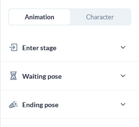 Enter Stage – this is how the character comes onto the screen
Waiting Pose – this is what the character will do when on screen
Ending Pose – this is what the character does when the reader has completed the required task (for example, signed up for the newsletter).
To see the different options within each stage, simply click on the arrow to open the drop-down.
Again, I like the extra thought of having these collapsible, as I find too much happening at once on the screen to be quickly overwhelming. By being able to collapse them and open just what I need, is a good feature.
The Enter Stage has 12 options, these include the character swinging in like Tarzan, strutting in like Woody from Toy Story, pulling out a camera snapping a photo etc.
The ones that really stood out for me were Accountant, Fitness Trainer, Coder, Designer, Creator, Handyman and Photographer. This was because if you were in those industries and used those character poses for your forms, it would add another level of branding.
The Waiting Pose has 3 options. These include Patience, Sleepy and Hurry Up. These are just the character making motions if nothing is happening (eg if the reader has not yet filled in the form).
Finally with have the Ending Pose which has 4 options. This is whenever the reader has completed the action. So for example, if they type in their name and email address it moves to another page with a Thank you confirmation and the character does its end pose.


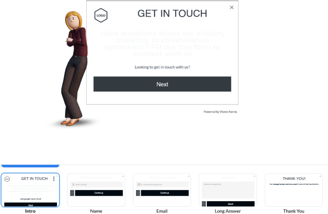
Multiple Pages
As with many forms, there are usually extra pages. The example below shows a Get In Touch option you can use as a contact form. By clicking next, the section page appears asking for a name, then an email and finally an enquiry box to submit.
This is the same if you are asking people to sign up for your newsletter with a lead magnet. The first page might be the details and the fields to fill in. Once done, the next page is a download button for the freebie and then a thank you page. All these pages are editable and you can delete unnecessary pages.
With the example below, you can see there is an area to add a logo. So not only can you change the text, font, colours etc you can also add your own logo, which is a nice touch.
Animated Design Example
I made several different projects, trying out different styles, animations and characters to get a feel for the feature.
If you would like to see an active animation, check the link below to one of the examples I created.
Animation Example
If you are interested in trying this out for yourself, Early Access is still available (at the time of writing this) and you can sign up to give it a try here.
Try Visme
If you want to give Visme a try, there is a FREE version as well as different levels of paid versions (correct as of writing this).

Don’t forget, you can get Early Access to try out Visme Forms for yourself – sign up here
~ ~ ~
If you do decide to give Visme Forms a try, let me know your own thoughts in the comments below.

Happy writing & stay safe
![]()
![]() I write articles on writing, marketing, blogging, organising, social media, books and some random stuff. I also create free printable resources. If you find my content helpful, and entertaining and like what I do, consider supporting me on ko-fi (where you will also find extra content I post).
I write articles on writing, marketing, blogging, organising, social media, books and some random stuff. I also create free printable resources. If you find my content helpful, and entertaining and like what I do, consider supporting me on ko-fi (where you will also find extra content I post).
All donations go to keeping my website running and helping me move towards publishing my novels.
